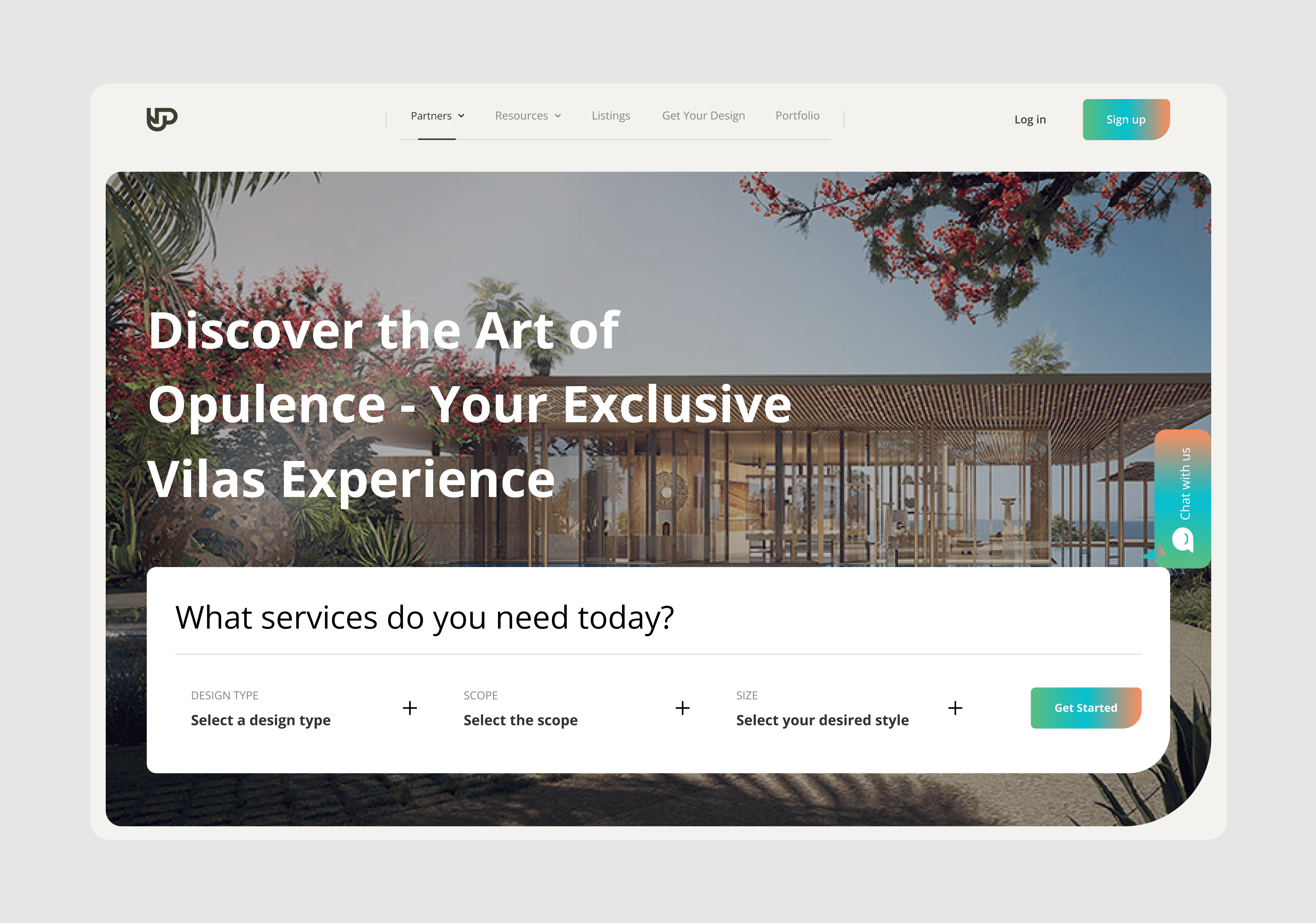
Challenges:
Hero section unclear: Users struggled to quickly understand the company's primary offerings. Text-heavy content: Overwhelming amount of text made key messages difficult to grasp. Ambiguous visuals: Graphics lacked clarity, confusing users rather than supporting the content. Information overload: Content was cluttered and unstructured, increasing cognitive load.
Process:
User Research & Interviews: Conducted interviews to pinpoint specific pain points and confusion areas. Content Streamlining: Reduced unnecessary text, applying concise and impactful UX writing. Clearly emphasized key services and benefits. Visual Enhancement: Created relevant, supportive graphics to simplify complex financial concepts. Optimized Information Structure: Applied UX principles (visual hierarchy, whitespace, scannable layout) for better readability.

Results:
Conversion Rate: Increased by 30% after redesign (validated through A/B testing). Bounce Rate: Reduced by 23%, indicating improved user engagement. User Satisfaction: Interviews showed 50-70% improvement ratings in content clarity and ease of consumption.


